
One of my associates asked me the other day, “what’s your favorite thing about graphic design and how has it changed over the years?”
That’s a loaded question but if there is one thing that makes or breaks a good design in my opinion the type. The font or fonts selected, and how they are spaced and interact with the visuals.
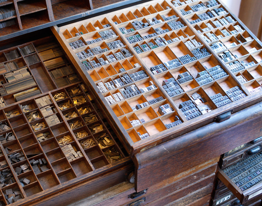
While my tenure in the business goes back several decades – at least it’s not back to the hand lettering days of monks rendering letter forms to build books. It does however go back to metal and photo hand set type.
I look back to my University of Utah college days when we had to design posters using hand set letters picked from a California type case. We then assembled the loose metal letters into blocks and positioned them on a surface. The type was inked up ready to transfer to paper by a hand rolled proofing press.
Seems pretty arcane. But if we look at the early 70s, photo type was just coming into it’s own. One would head into the darkroom, select a font film-strip, then project the image onto photo paper. The paper was processed much in the same way one did when printing black and white photographs.
As you can imagine one had to have several skill sets. Proper dark room technique, an expert eye for letter spacing and eye for the size. There was no – hmmm I wonder if making it 4 points larger will look better. You had to know exactly what your result needed to be before you started, no trial and error.
Often times, we used rubdown lettering or transfer type to create the perfect looking headline. The industry moved on to photo type composition on a machine. This created letter spacing issues, as the letter spacing was pre-set.
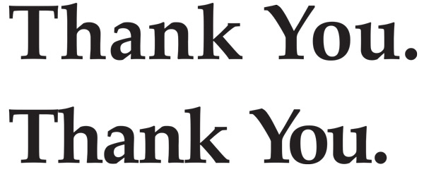 Today, we have the luxury of selecting the perfect font and size. But it does not end there. To me and many of my design friends and typographers, great care needs to be taken in selecting the perfect space between letters so they appear to be equidistant from each other. You must do this by kerning or spacing each individual letter. It takes a bit of time and most these days don’t bother, but the results are evident in making a great design.
As an example, here is a headline generated from the computer ad one that the designer has taken the time to letter space properly.